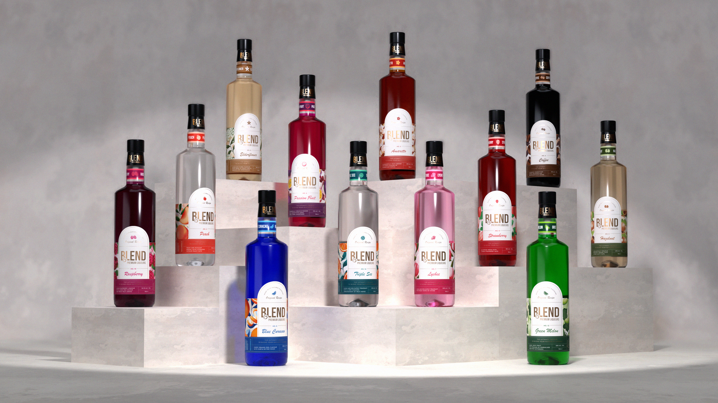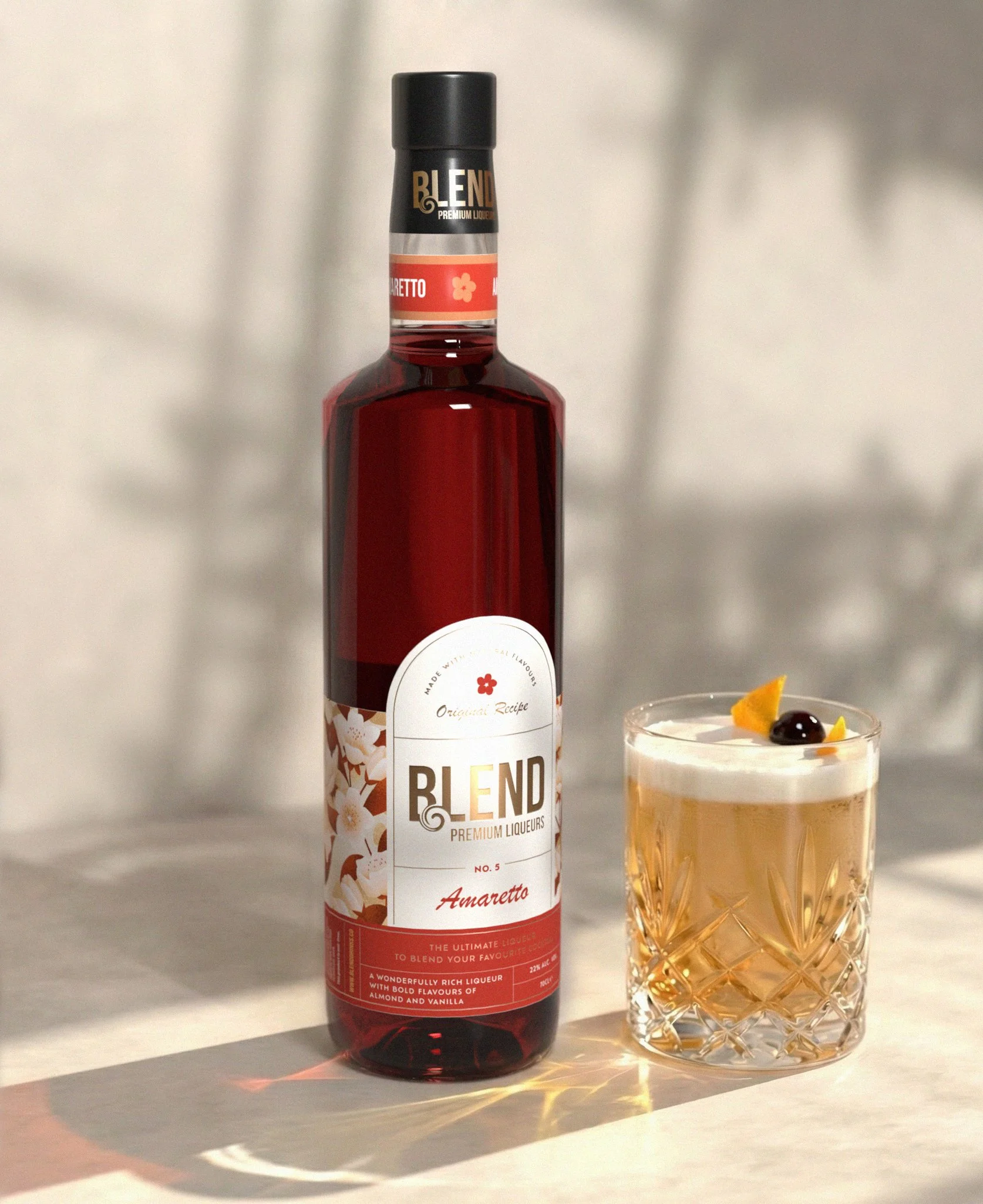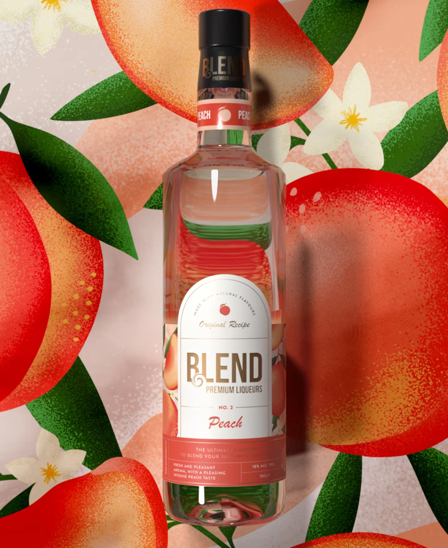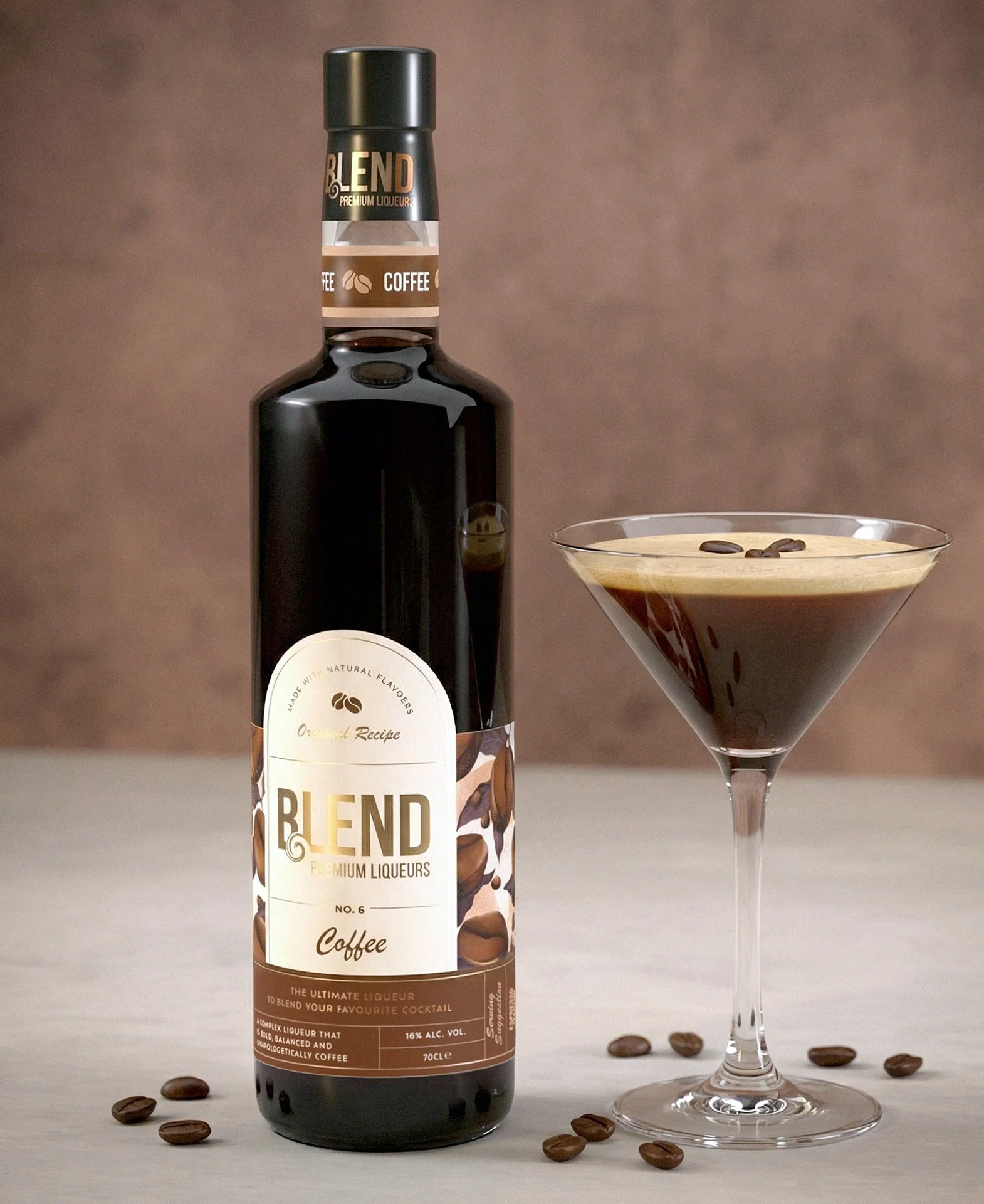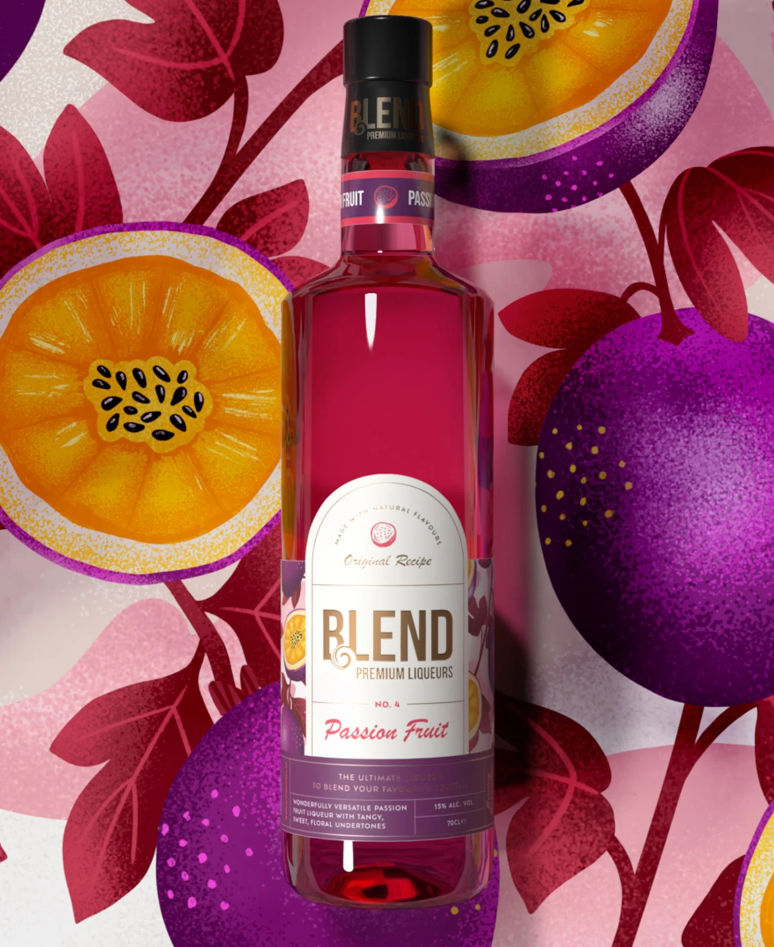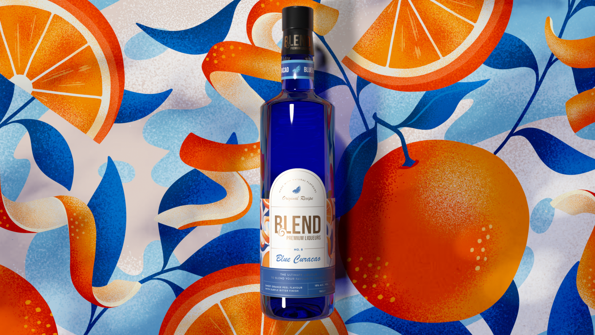
Blend sought to become the go-to liqueur brand for bartenders, requiring a packaging evolution that elevated premium cues while remaining vibrant and solutions-driven. The previous full-wrap design restricted liquid visibility and lacked the quality cues required to sit confidently within back-bar environments.
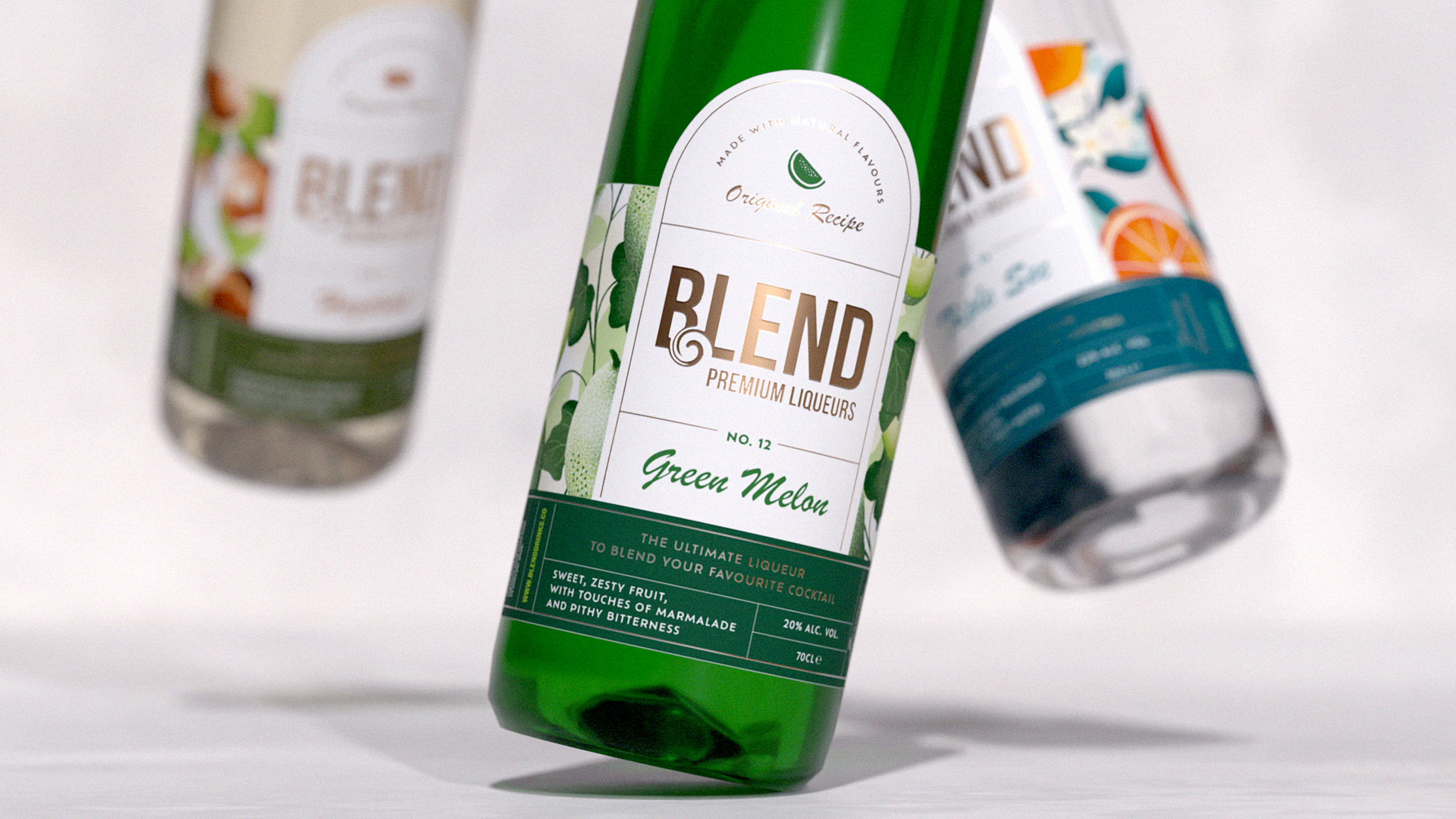
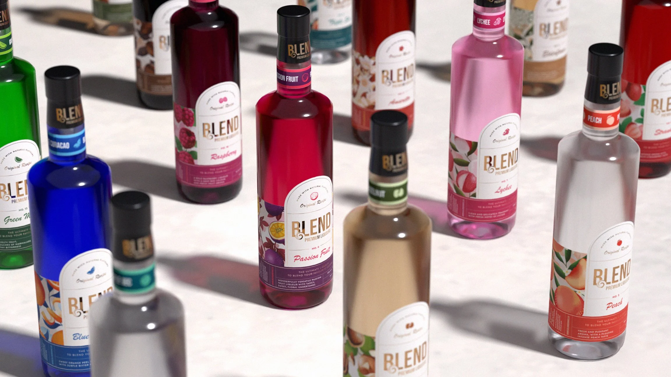
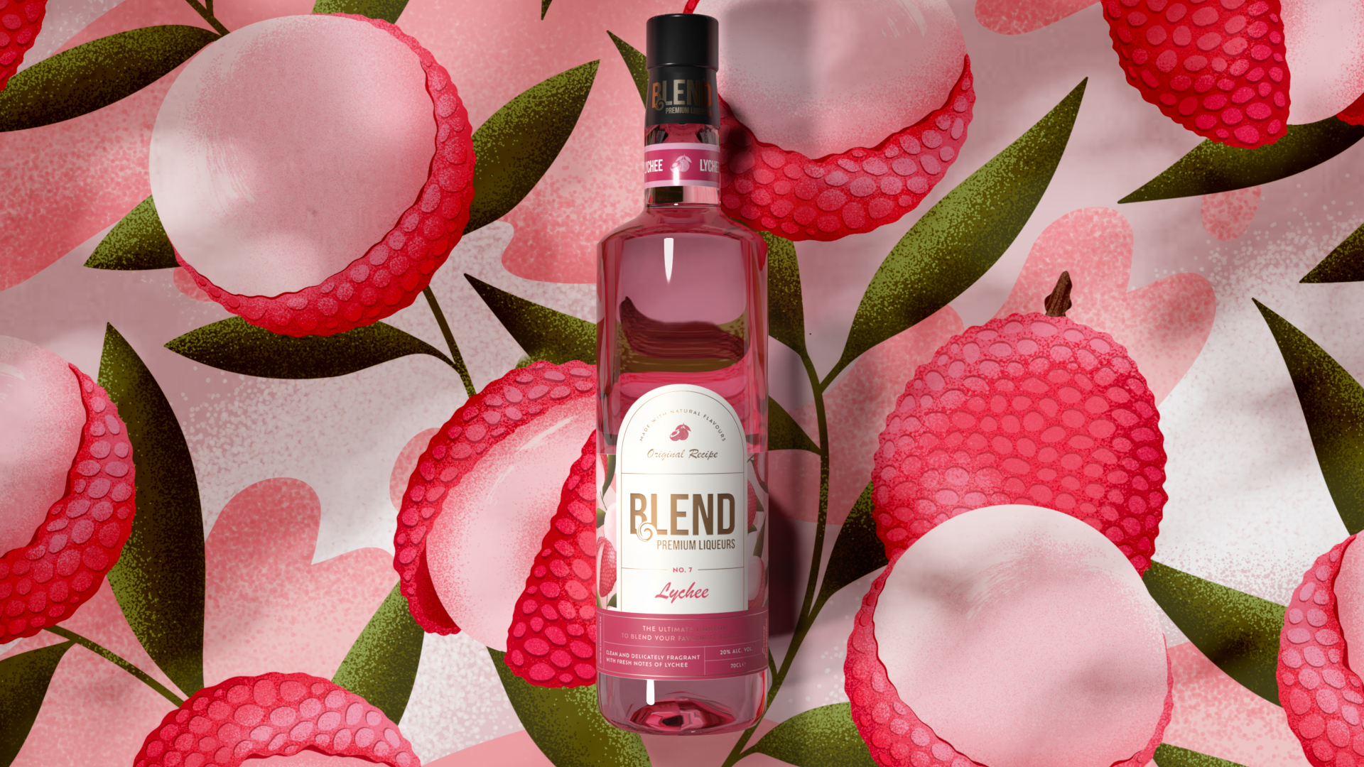
The redesign introduced a clear bottle with a paper label to enhance quality perceptions and build trust, allowing the liquid itself to become a key visual asset. Bespoke illustrations of real fruit and ingredients were created to drive immediate variant recognition, supported by product-specific colours, icons and neck labels to ensure quick flavour identification in busy back-bar and speed-rail settings. The result is a more cohesive, premium and distinctive range that balances professional bar functionality with consumer appeal, underpinned by a simplified and scalable visual system designed to flex across future SKUs and brand extensions.