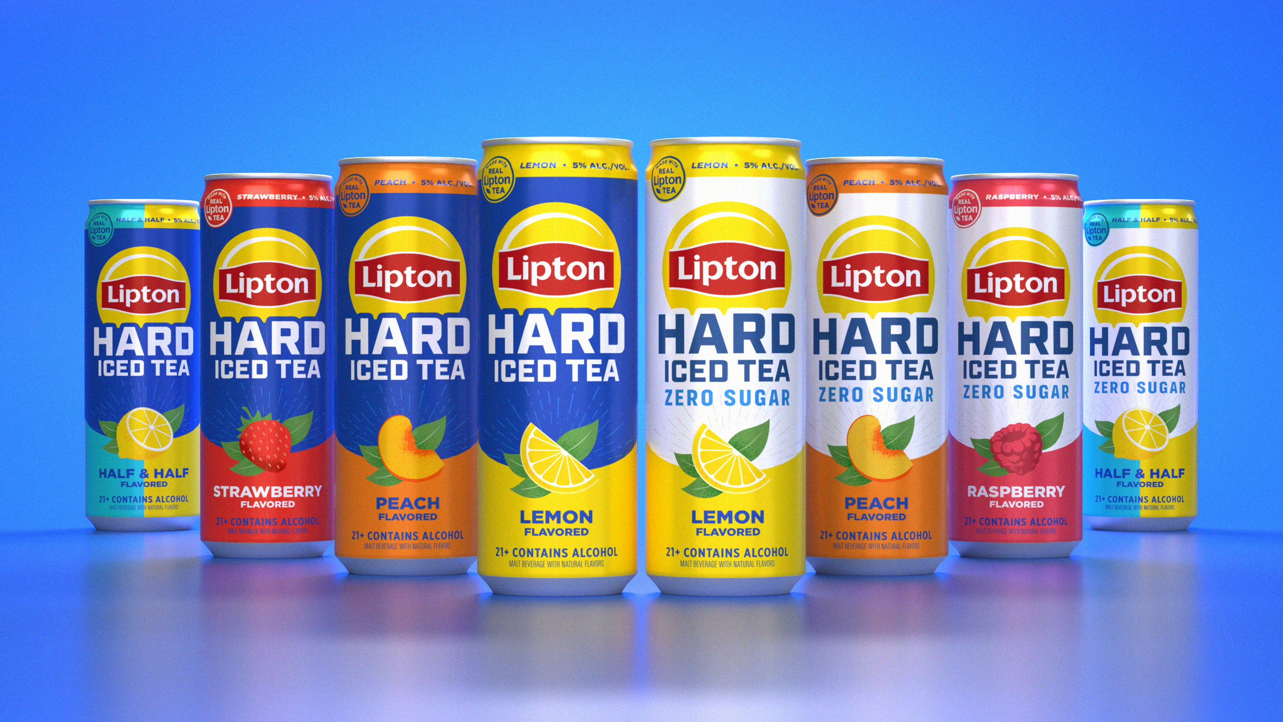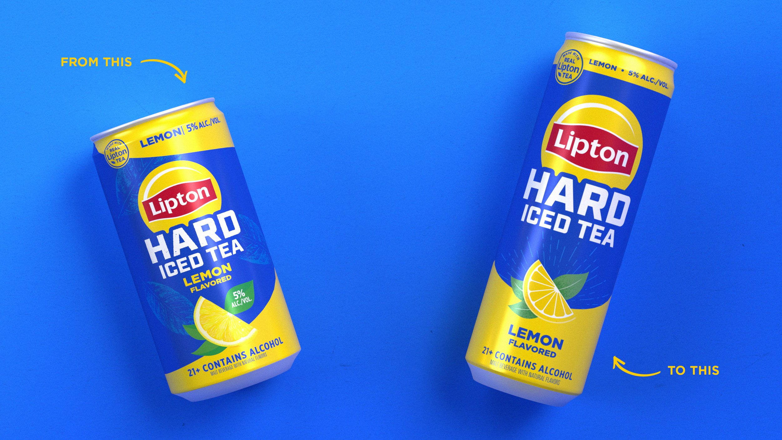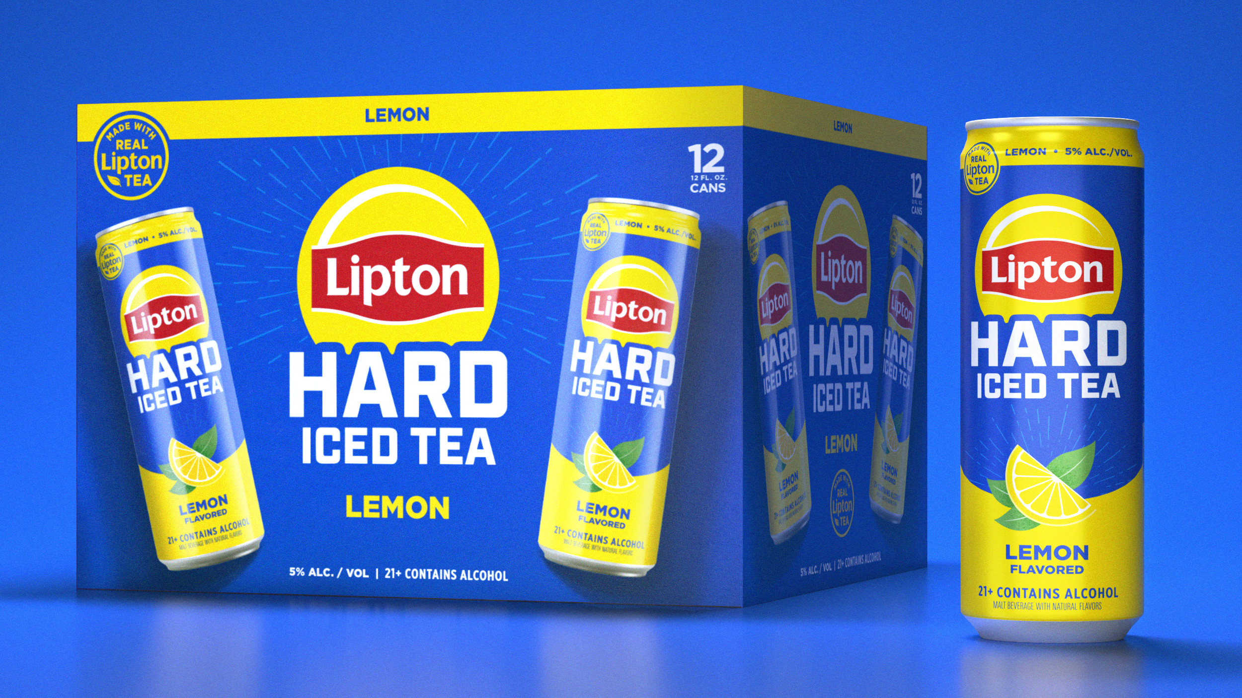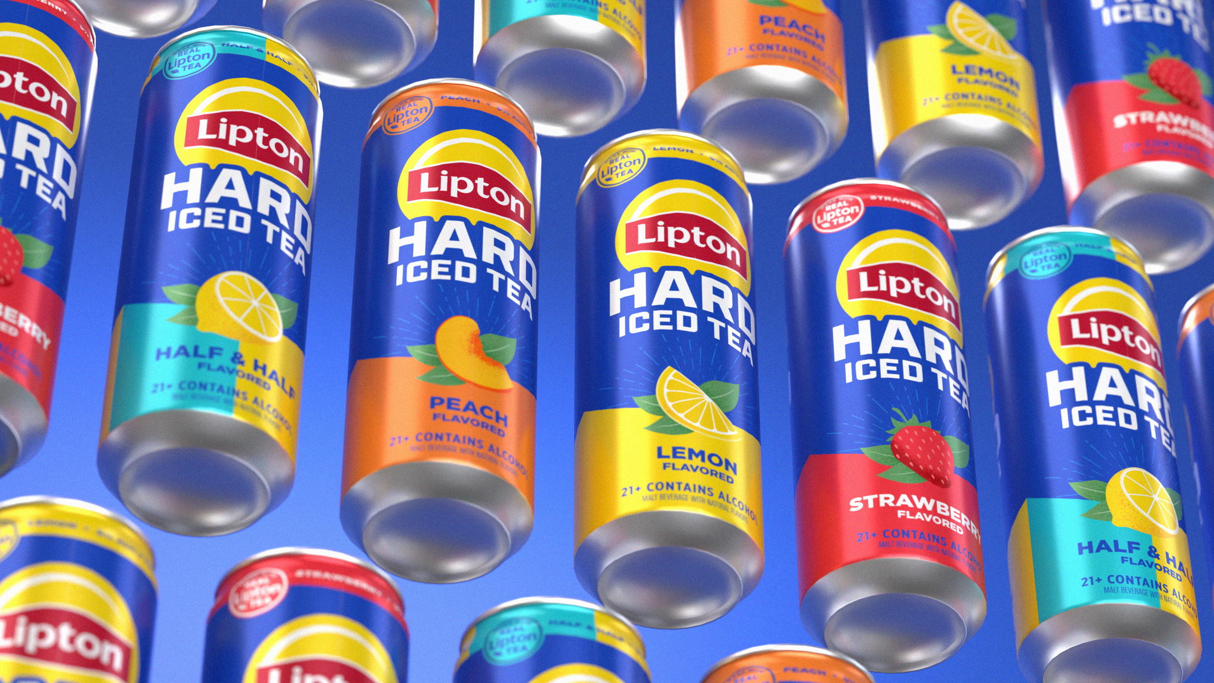
This Lipton Hard Iced Tea redesign focused on modernising the brand’s packaging to improve clarity, cohesion, and shelf impact across the range. The existing design lacked clear hierarchy, making flavour differentiation and key product callouts harder to navigate within a competitive RTD category.
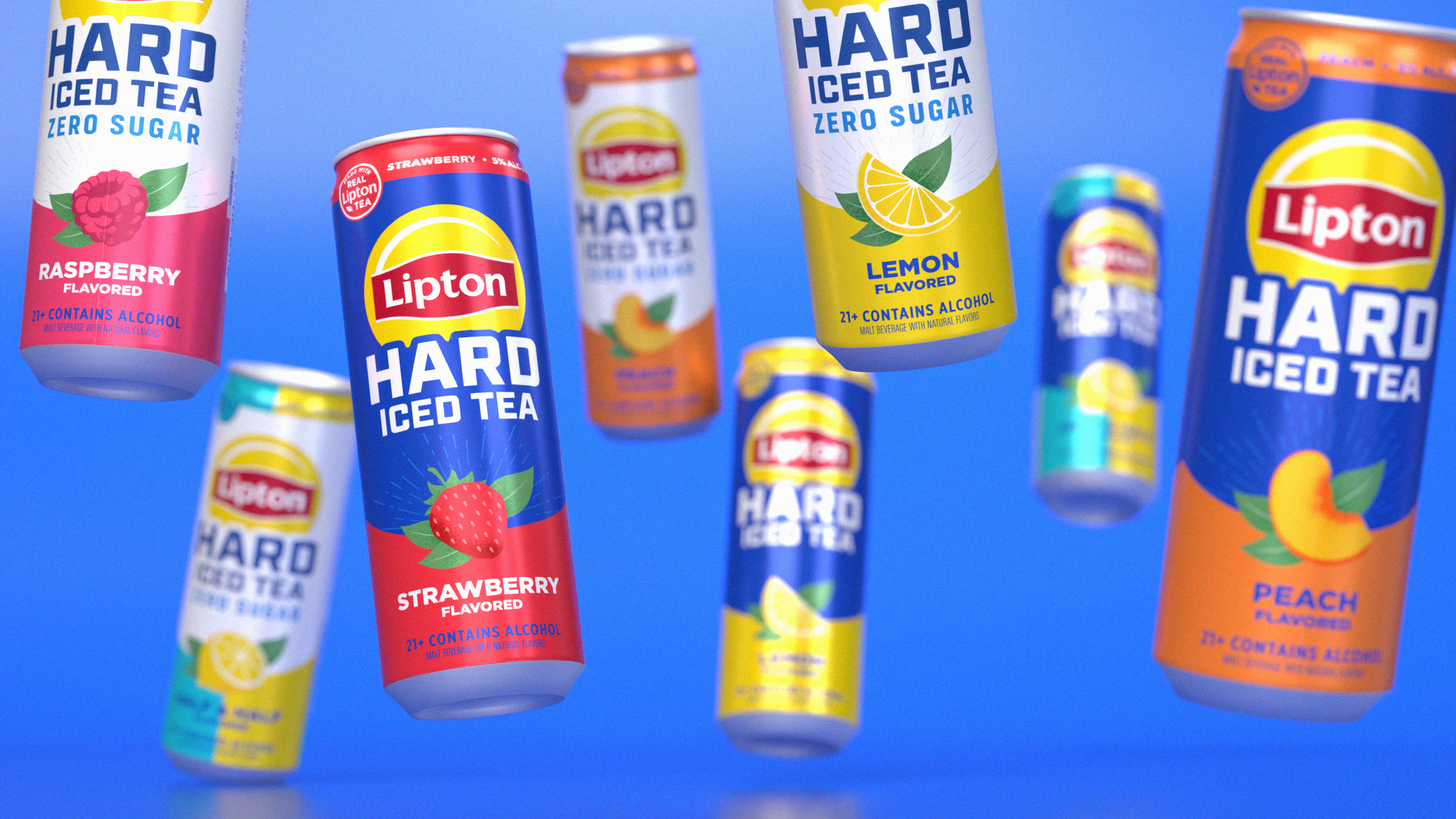
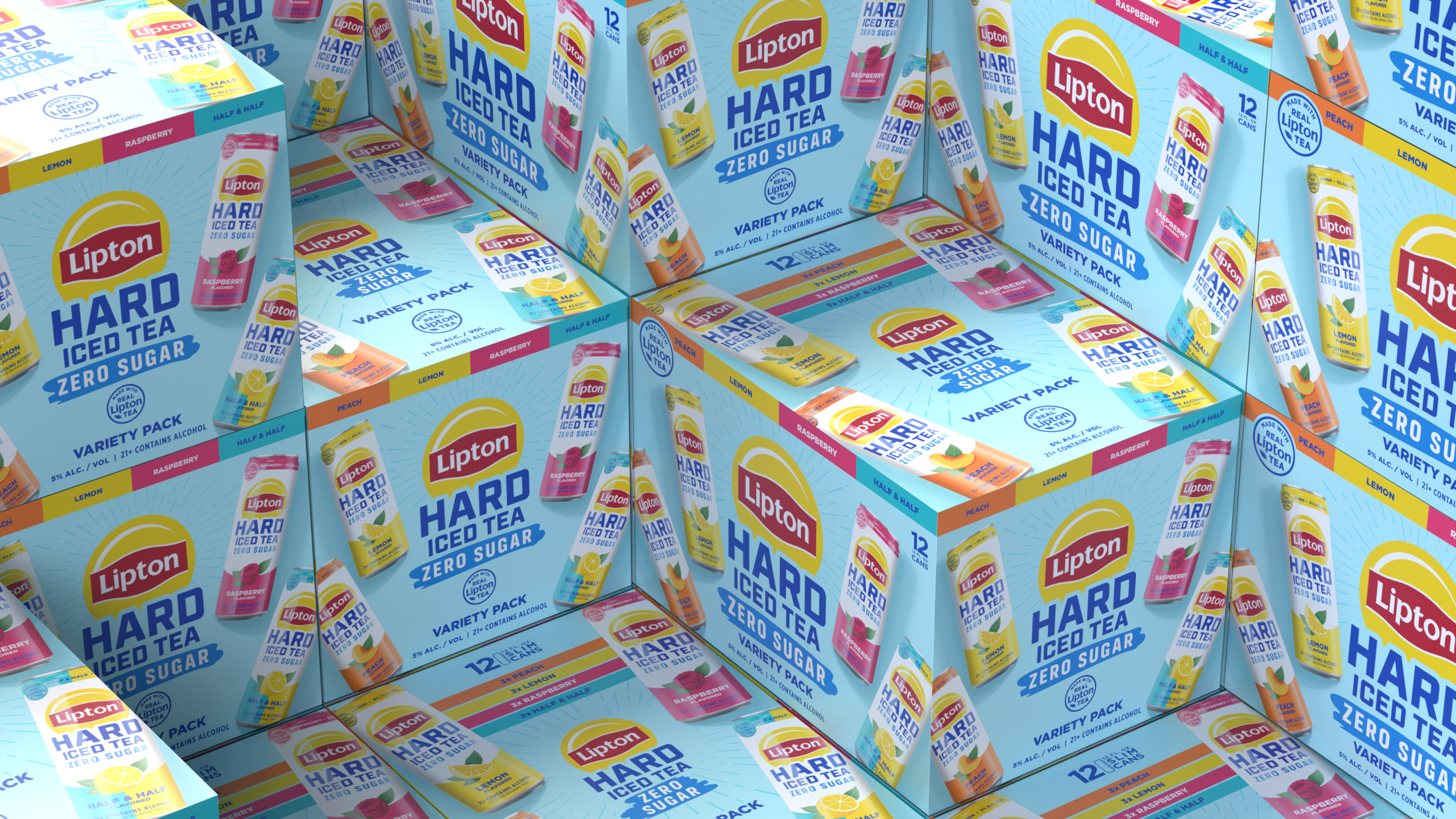
The refreshed system introduces a cleaner, more contemporary layout with improved hierarchy, clearer on-pack messaging, and new illustrative flavour icons to strengthen recognition. A refined colour palette and simplified typography create a more confident, premium feel, while the same design framework was extended to launch the new Zero Sugar range, ensuring strong family recognition and long-term scalability.